 Mesa has unveiled its new logo (here is the Tribune's report as well). I don't really like it, but I don't hate it either. I am sure that the graphic wizards over a Exurban League will have more thoughtful things to say about its design and composition. In the meantime, here are my comments:
First, it could have been a lot worse. Look at Peoria. They spent a bunch of money to get a horrible tagline like "naturally connected" and some awful colors. I am glad that Mesa got rid of the line about the people and the service. It hadn't really been true for awhile and it also made me feel like they were trying to sell waterheaters instead of selling the merits of a big city.
Next, maybe its the fault of the newspapers, but I couldn't get a decent version of the logo to post in this blog. It looks all pixelated and "hairy." The logo gets thrown on everything under the sun and sometimes its going to look better than others. They are going to have to do some major quality control on that thing to make sure those smooth ridges look good.
Plus, the lowercase thing is fairly hip right now, but I don't think it will last. In a couple of years, I bet we'll see it go to either all caps, or a combination. This isn't some nightclub we are talking about, the lettering should be a little bit more timeless.
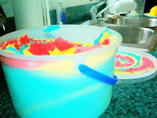
Finally, the colors aren't my favorite, but they are primary and not something that is going to go out of style over time like teal and purple (ahem, D-backs). I guess they are fine, but they certainly remind me of a few things:


1 comment:
It's not that bad of a bad design. It's free which immediately makes it a cool design.
Post a Comment